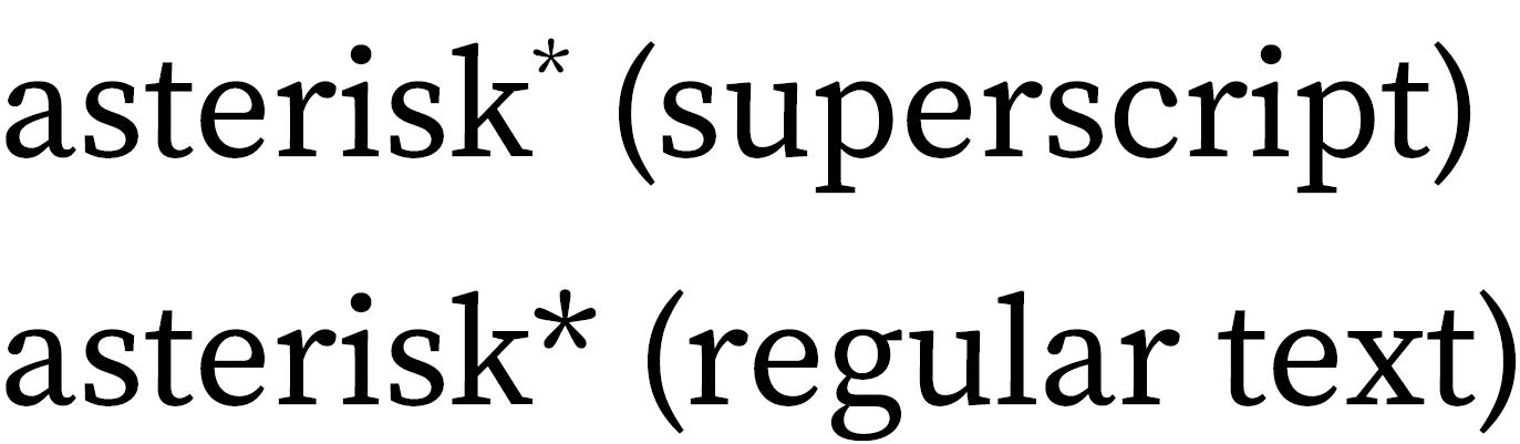
Q. If, following CMOS 3.80, I’m using symbols to indicate notes to a table (asterisk, dagger, double dagger, and so forth), should the asterisk be superscripted like the other symbols?
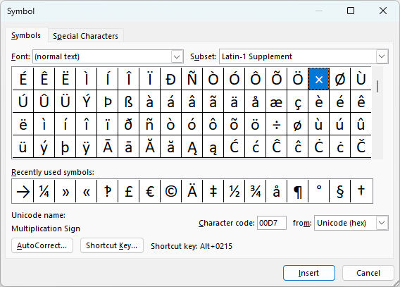
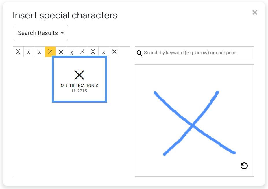
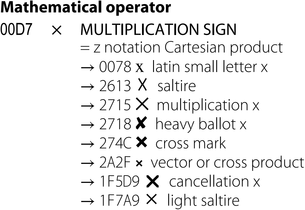
Q. Seeking your expert advice on the following problem, now that I’ve run into it for about the dozenth time: When the names of brand collaborations use an “x” between the two entities, what’s the best way to style the “x”? For example, a collaboration between Louis Vuitton and Yayoi Kusama. Should it be a capital X? Lowercase x? A multiplication sign?
Q. How can you find out if you have the right Unicode character? Some characters are hard to tell apart.
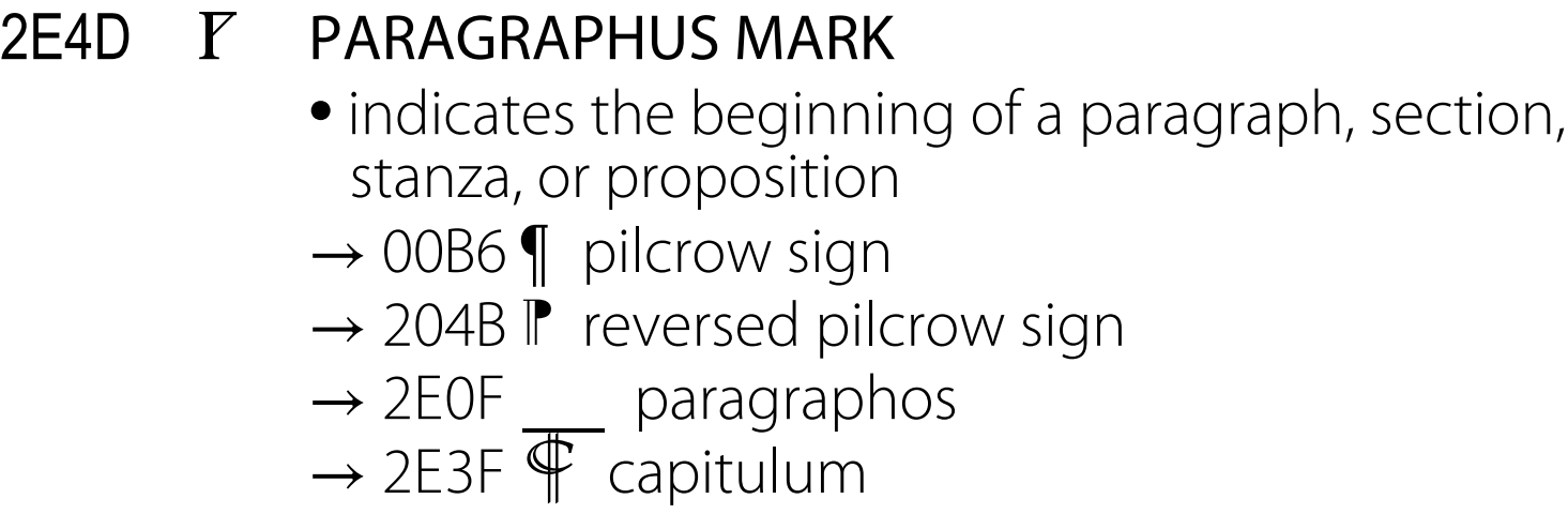
Q. I’m preparing a critical edition of a seventeenth-century poem that has over seventy (numbered) stanzas, and I’m wondering if there is a special symbol to designate, say, “stanza 64.” Paragraphs have the pilcrow ¶, and sections are marked by §, but is there a symbol for stanza that I’ve missed?
Q. Hi! I was wondering if you recommend uppercase or lowercase for names of emoji. Capitalizing provides clarity, but it also does an end run around the issue of whether to hyphenate something like “winking-face emoji.” If it’s capitalized, no hyphens needed: “Winking Face emoji.” Plus the hyphens look bad aesthetically in my opinion. 🤮😉 Thanks so much for your input—I appreciate it! This is an issue fiction editors are running across with more and more frequency.
Q. Can I use the ellipsis character in my manuscript? Or do I need to use Chicago’s spaced periods?
Q. Where does an emoji go in a sentence? Before or after the period? ✏️ Having a tough time deciding 🤔.
Q. Hi, Should the “th” in “49th parallel” be superscript? Thanks.
Q. I’m wondering your take on my company’s bigwigs’ insistence on using a dollar sign in the following sentences: (1) “How about 25 little cigars for less than $35 little dollars?” (2) “We’re sending summer out with a bang . . . for less than $35 bucks!” I’ve made my case against it and basically have been told that I’m being a nitpicker.
Q. I notice confusion in publication in regard to whether a space should precede and/or follow relation signs. My suspicion is that it is <10 km but p < .001.